When it comes to content creation, I believe in a healthy balance between personal ideation and using technology to help streamline my process. Whenever my clients allow, and where it is relevant, I will share real images. But because I have so many ideas that I’m bursting to share with you, I use AI tools to help create my imagery. This method allows me to share my dreamy, aspirational, mood board-like vision for your home in a timely and relevant way. Every article has been reviewed, fact-checked, and edited by me for quality, and I only recommend ideas that I personally love!
Let’s talk about the stratospheric importance of curb appeal! When it comes to your home’s exterior, the color scheme you choose is as good as the first impression. It sets the tone for everything and makes your home feel welcoming and timeless. Whether you’re craving something classic or leaning into modern design trends, I’ve rounded up 25 gorgeous exterior color schemes to help your home truly stand out.
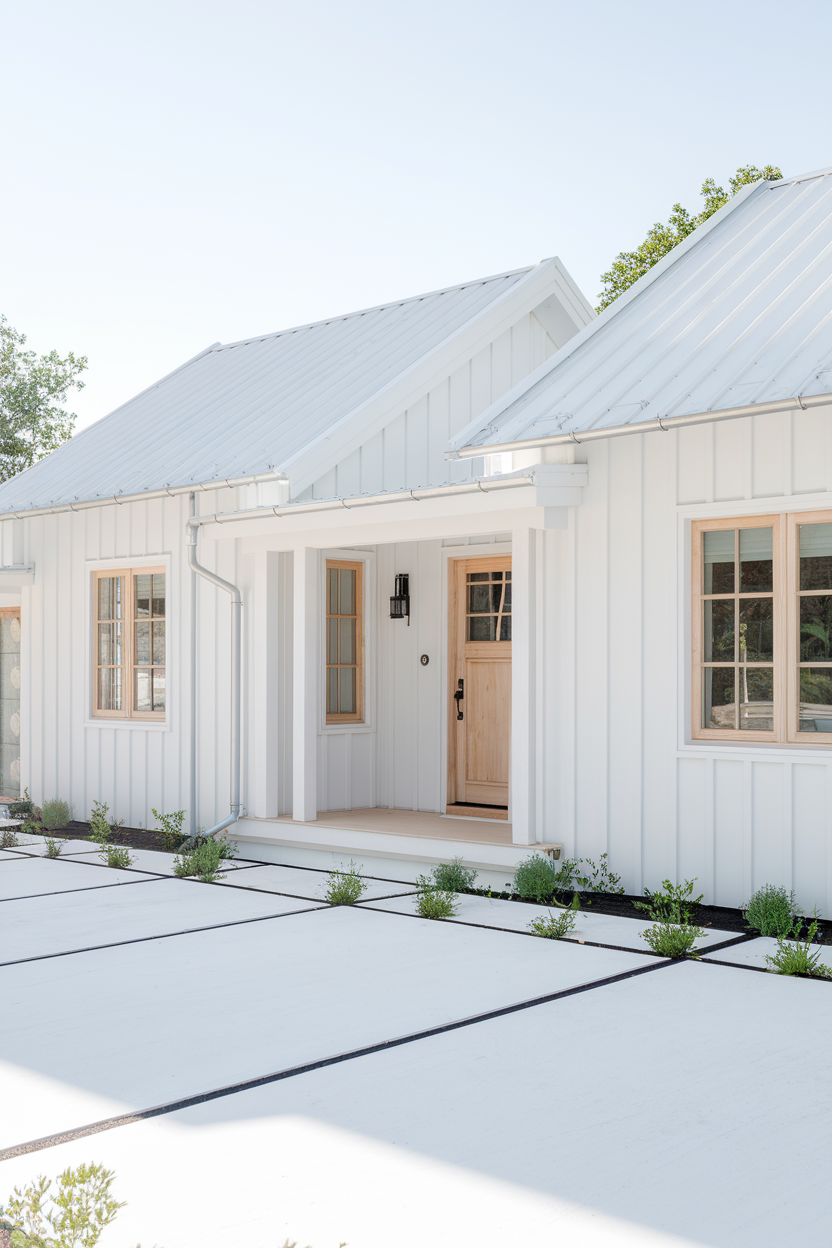
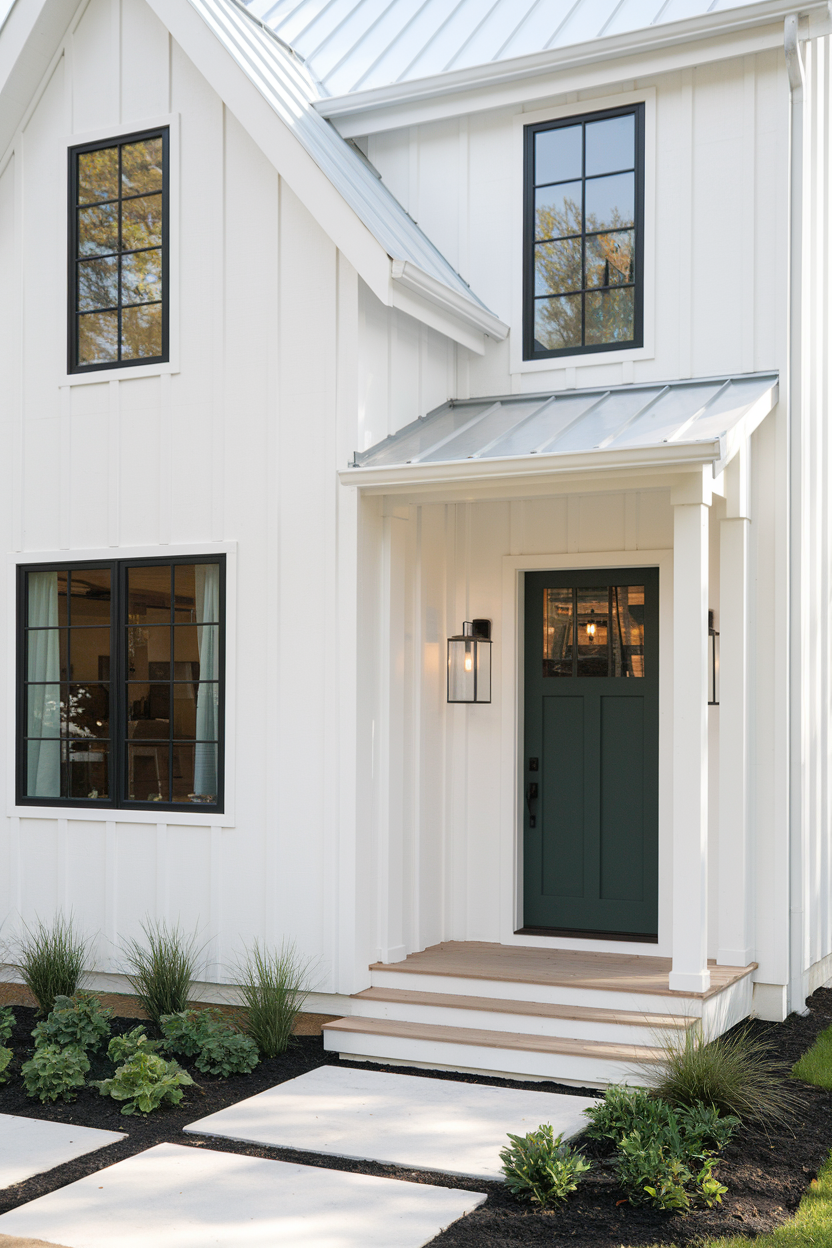
1. Modern farmhouse exterior color schemes
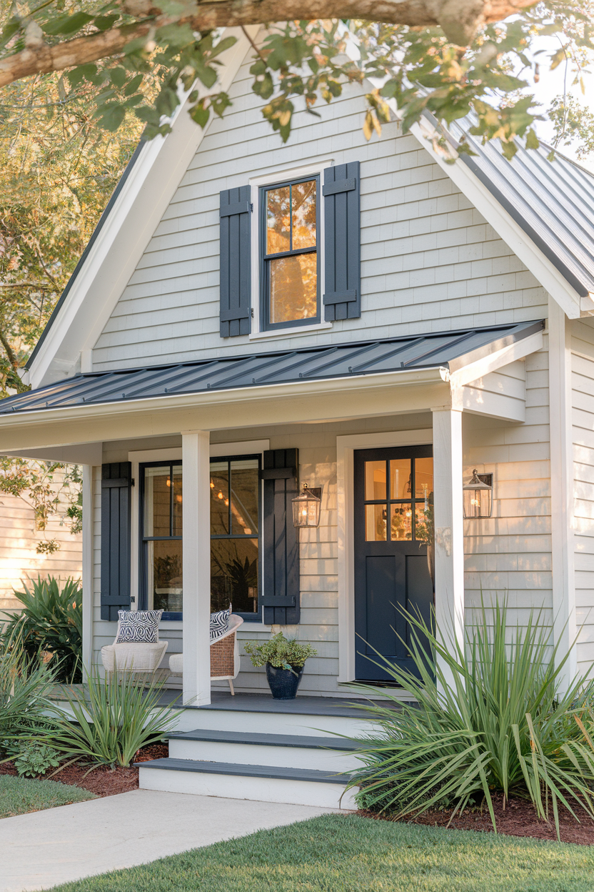
Think soft whites, light grays, and muted earth tones paired with bold black or charcoal trim. The modern farmhouse look has a timeless feel that lets the architecture of your home shine. Want a little more personality? Add a pop of color to your front door—navy blue or deep red always looks great. This combo is the perfect way to boost curb appeal!
2. Coastal exterior color schemes
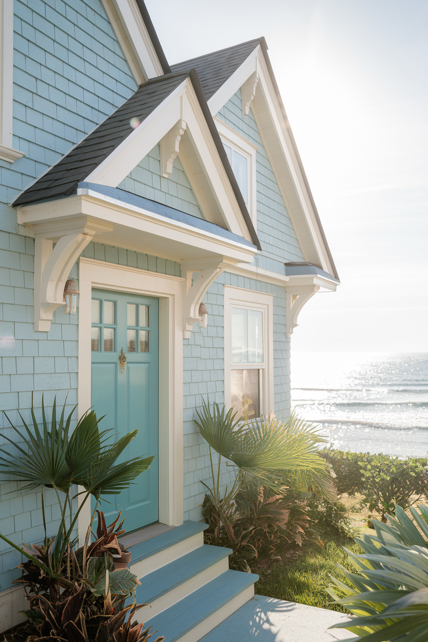
Nothing says relaxed beach vibes quite like a coastal color scheme. Picture soft blues, seafoam greens, and sandy beiges creating a calm, serene atmosphere around your home. I’m a huge fan of pairing a light blue or seafoam green with crisp white trim to keep things fresh. And for that added punch, a teal or navy front door can give your home that tropical, coastal feel that’s hard to beat.
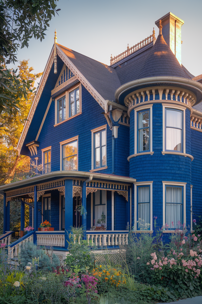
3. Victorian exterior color schemes
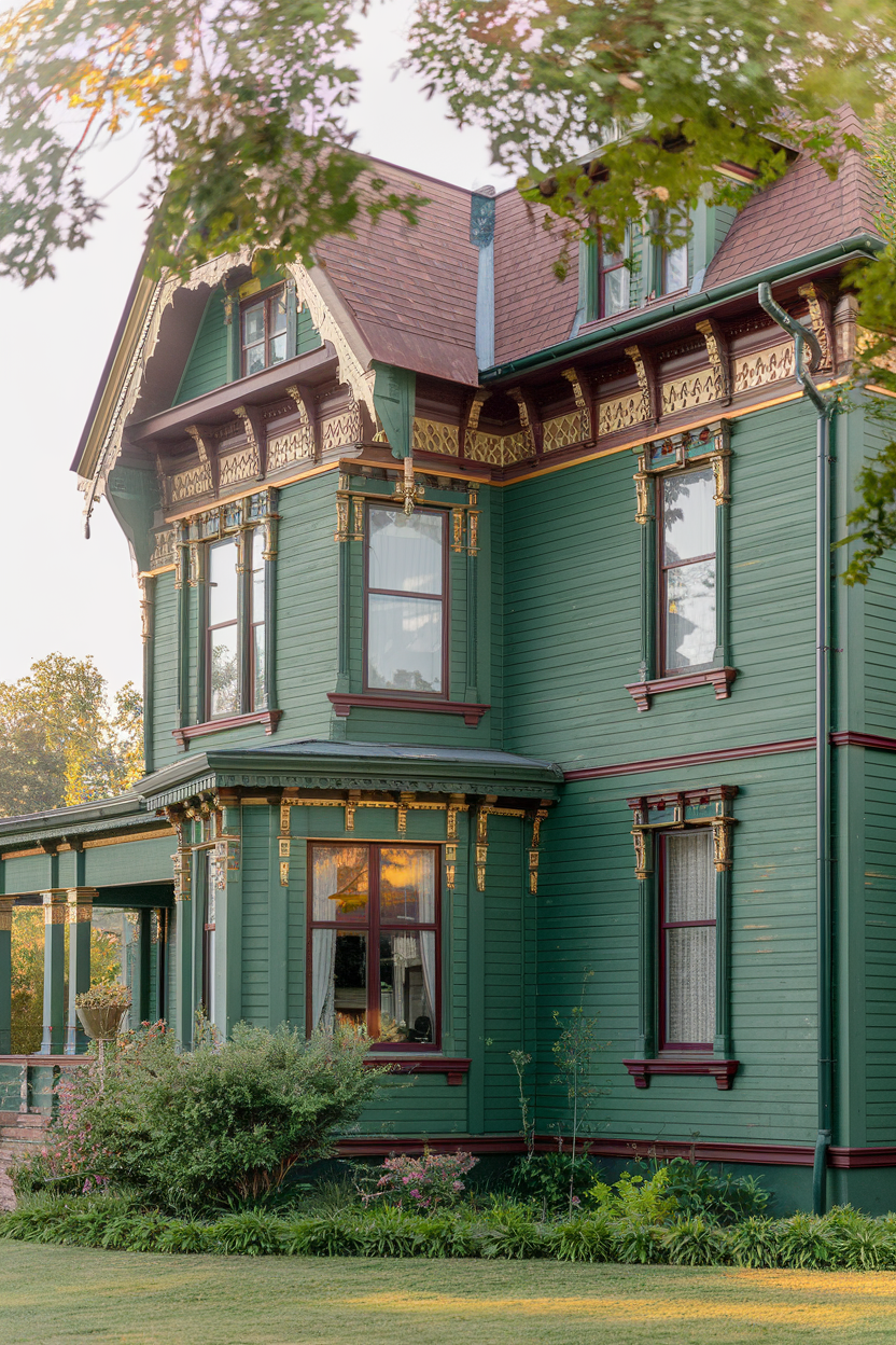
Victorian homes are all about bold elegance and intricate design, and your color scheme should reflect that. I love using rich tones like royal blue, burgundy, or emerald green, with lighter shades of gold or ivory to really highlight all those beautiful architectural details. It’s a regal, historical vibe that never goes out of style.
4. Scandinavian exterior color schemes
Less is more with Scandinavian design, and that goes for your exterior color palette too. Imagine crisp whites paired with soft light grays for a fresh, airy look. Then, add some warmth with natural wood accents—perfect for the front door and window frames. This combination is effortlessly chic and creates a serene, minimalist vibe that you’ll love.
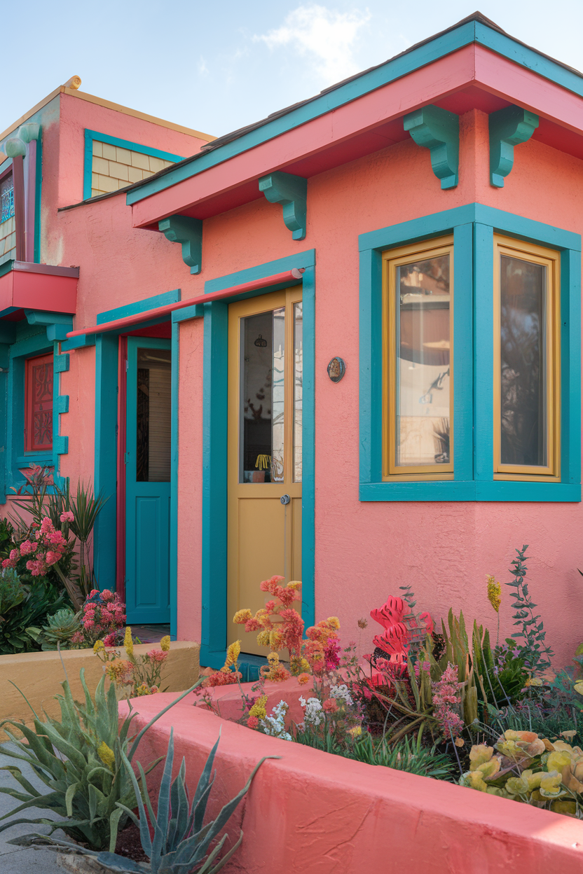
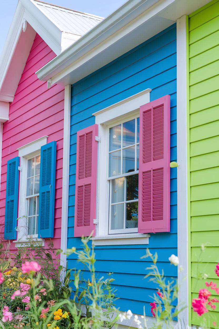
5. Key West house exterior color schemes
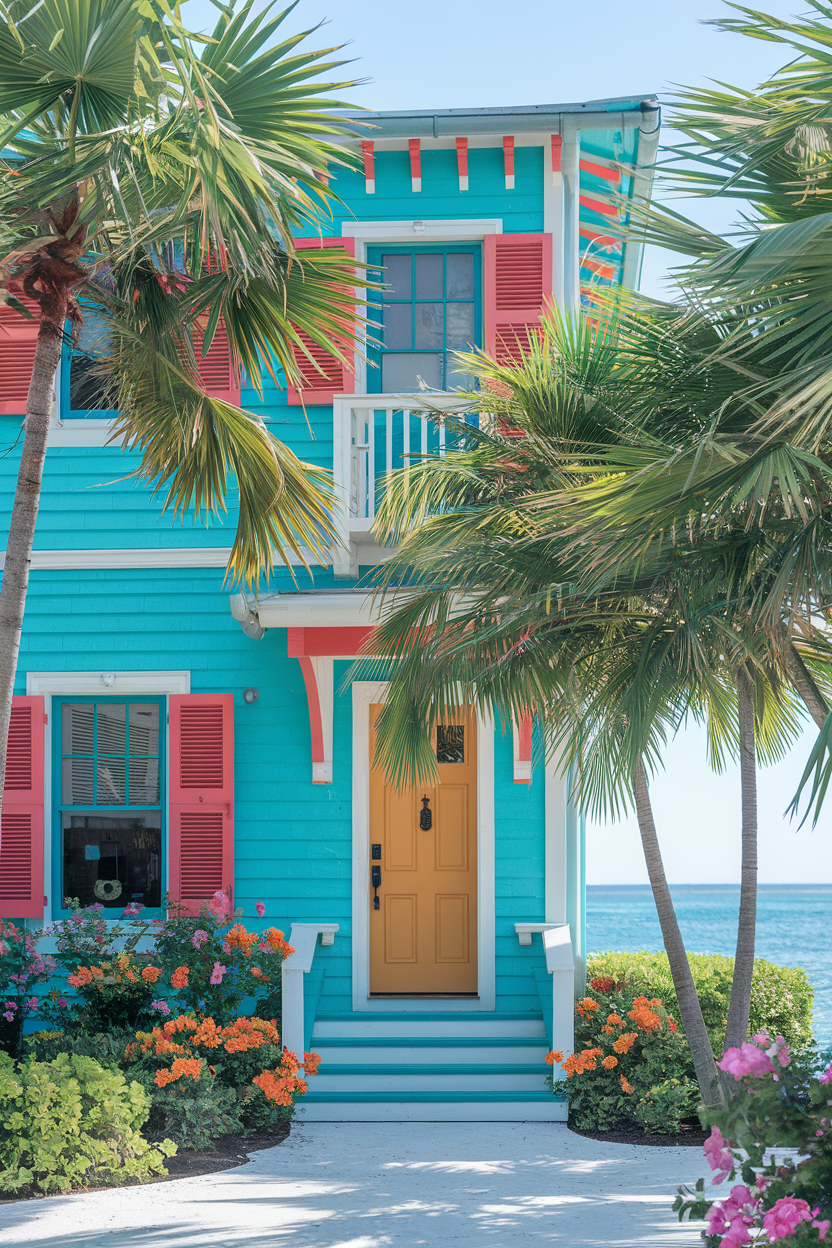
For a little fun in the sun, why not embrace a Key West-inspired color scheme? Bright, bold hues like turquoise, coral, and sunny yellow scream tropical paradise. I recommend using these vibrant shades for the main color and soft neutrals like white or beige for trim. This playful color combo is perfect for giving your home a cheerful, welcoming atmosphere.
6. Neutral exterior color schemes for modern homes
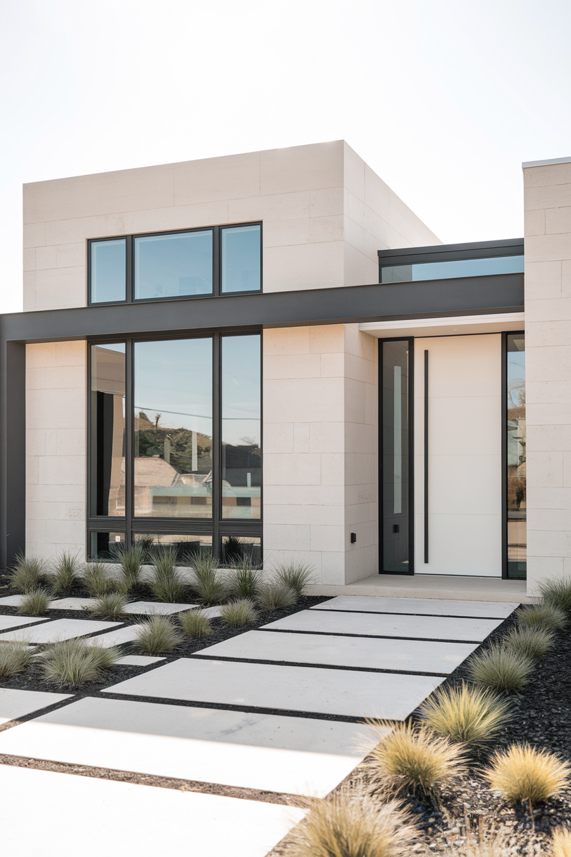
If modern and sleek is your style, neutral color schemes are the way to go. Soft whites, grays, and taupes create a sophisticated look that will never feel dated. For a bit of contrast, pair these shades with charcoal or deep brown trim. It’s timeless, and it gives your home a sophisticated edge that’s understated but absolutely gorgeous.
7. Queen Anne exterior color schemes
When I think of a Queen Anne home, I picture bold, dramatic colors. Royal blue, emerald green, and deep burgundy pair beautifully with gold or ivory accents to create a regal, historic look. This combo really makes the intricate woodwork and details pop, and the result is nothing short of grand.
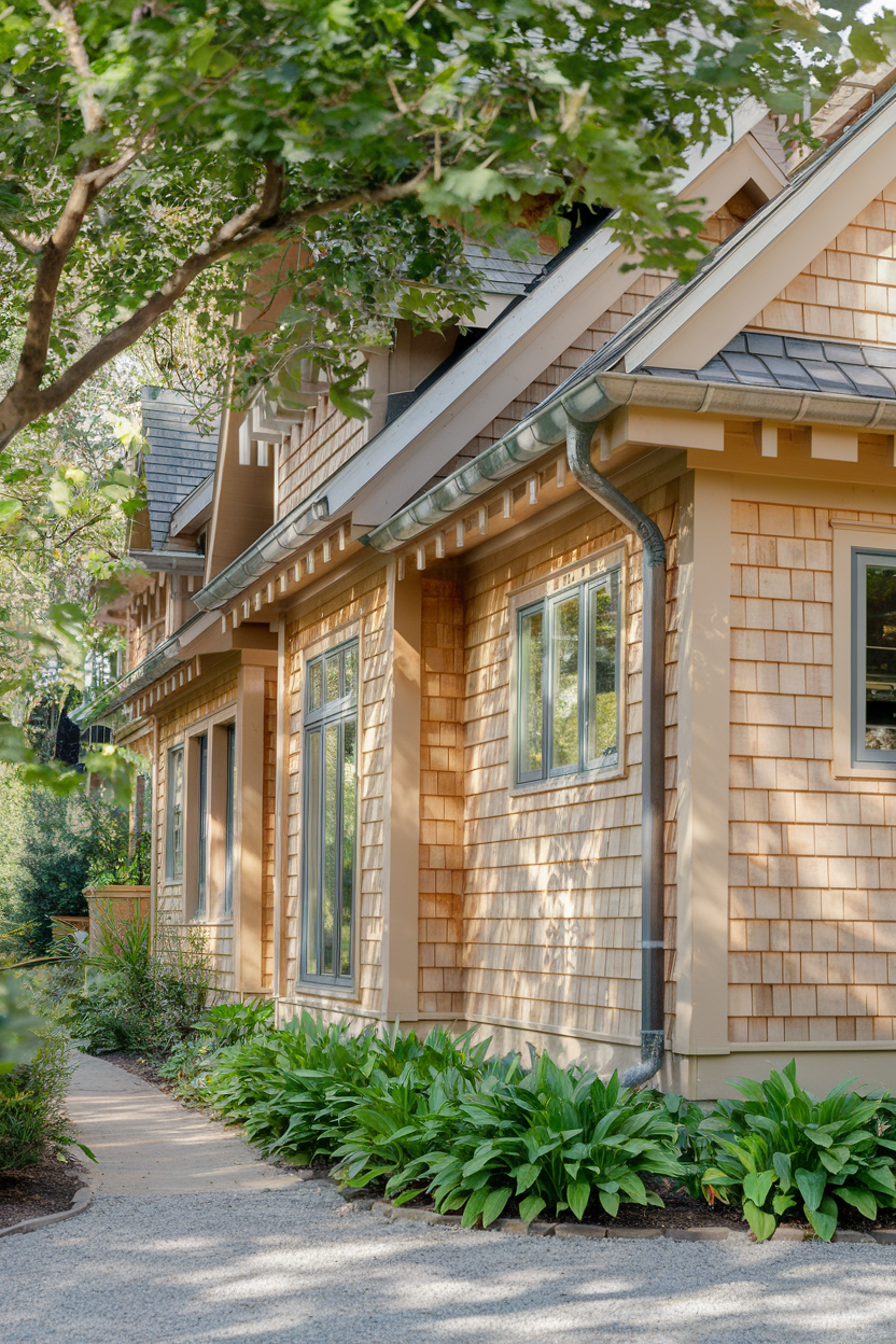
8. Craftsman exterior color schemes in neutral tones
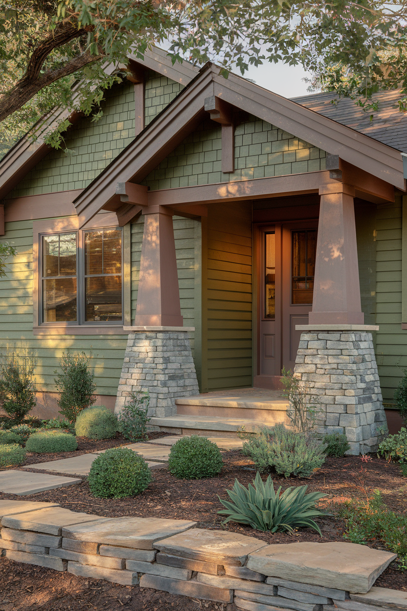
Craftsman homes are all about celebrating natural materials, and their exterior colors should reflect that. Earthy tones like olive green, taupe, and deep browns work beautifully with wood and stone to create a grounded, cozy atmosphere. If you’re looking to embrace that rustic, welcoming vibe, this palette is a dream come true.
9. Home exteriors with red brick
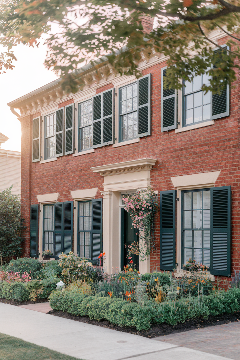
How gorgeous does classic red brick look paired with similarly classic colors? Soft whites, creams, and deep greens create a timeless look that allows the warmth of your brick to shine. I’m all about using soft neutrals for trim and darker shades around windows and doors to really frame that beautiful brickwork. This combo is beautiful and timeless.
10. Exterior color scheme for Cape Cod homes
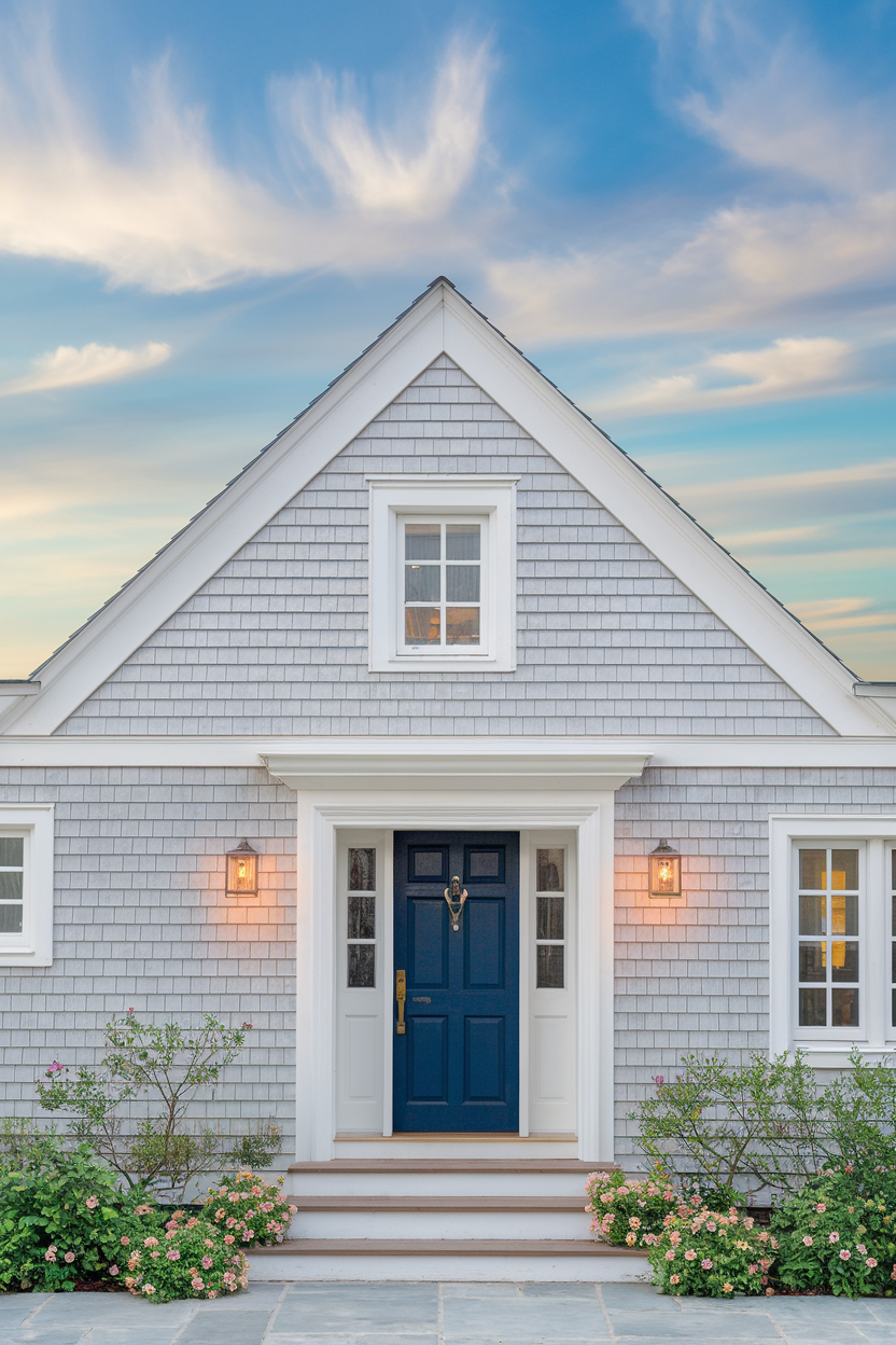
If you’re dreaming of a coastal retreat, the Cape Cod exterior color scheme is where it’s at. Soft blues, grays, and whites evoke that breezy, nautical feel we all love. For a classic look, pair a pale blue or light gray with white trim, and you’ve got an inviting, serene exterior perfect for coastal vibes or creating that dreamy coastal retreat.
11. Colonial exterior color schemes
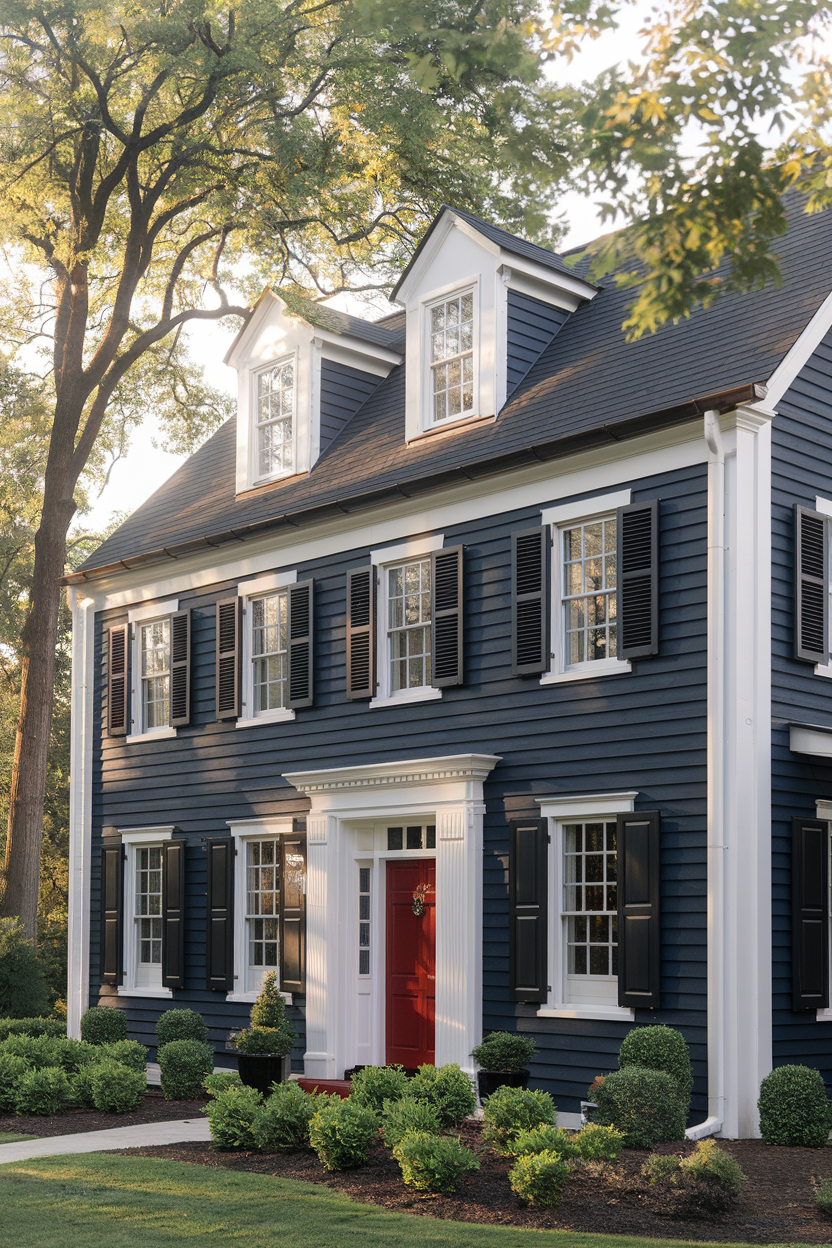
Colonial homes are known for their symmetry and stately design, so it only makes sense to go with deep, traditional tones like navy blue, dark gray, or hunter green for the main color. Pair with contrasting white or ivory trim, and you’ve got a refined, timeless look that enhances the home’s architectural features. Simple yet sophisticated, this palette never disappoints.
12. Contemporary urban exterior color schemes
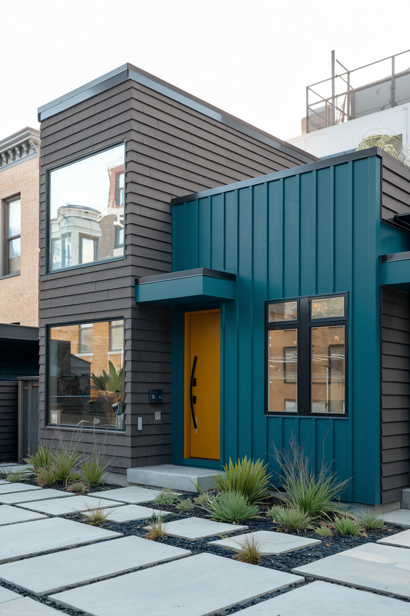
Contemporary urban homes are all about making a bold statement, and that’s exactly what a modern color scheme does. Think dark hues like charcoal, steel gray, or even black paired with bold pops of teal, mustard yellow, or deep red. It’s edgy, sleek, and the perfect reflection of city life. This color combo is the definition of modern sophistication.
13. Farmhouse with a pop of color
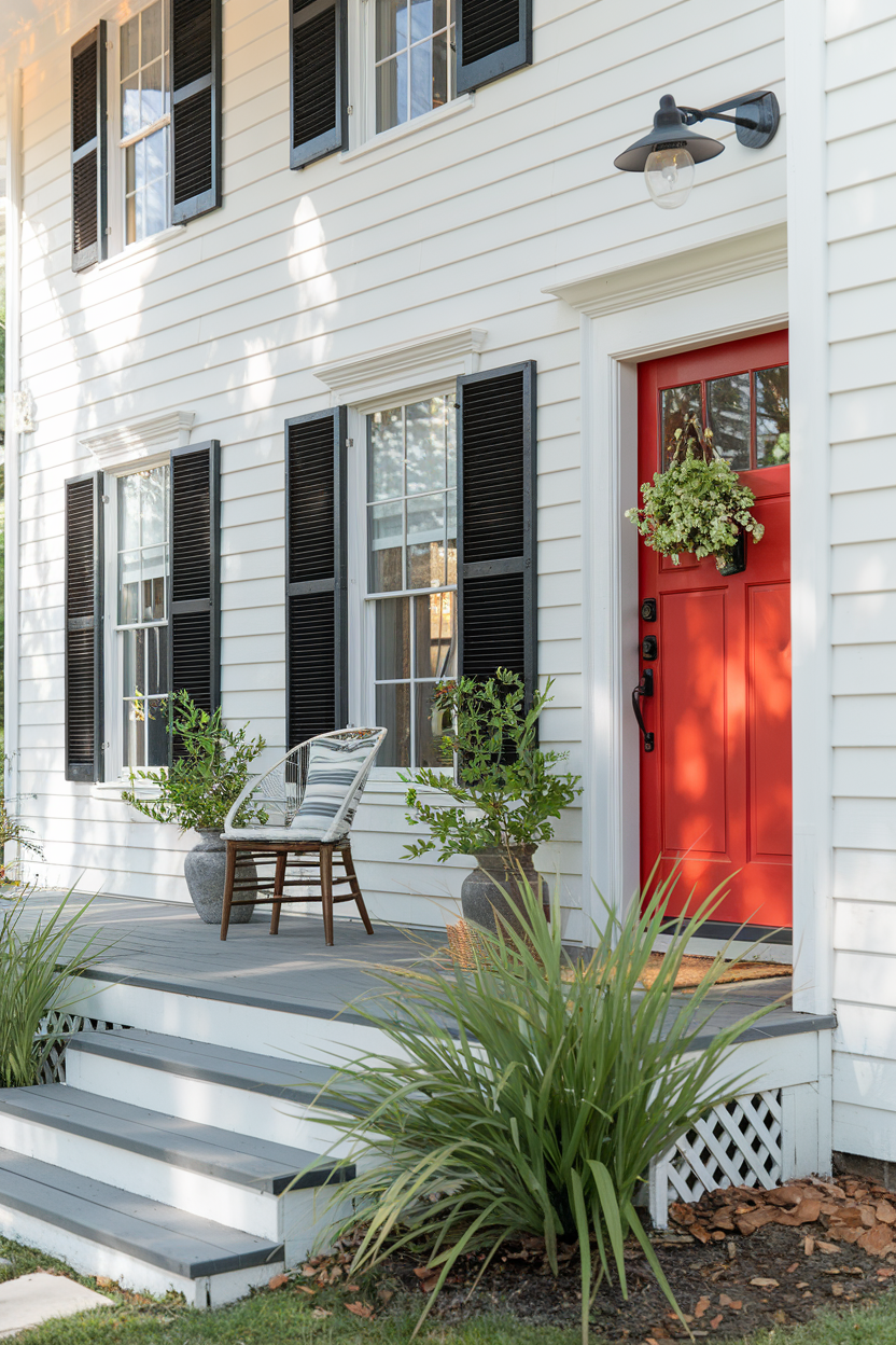
Farmhouse exteriors are known for their soft neutrals, but why not spice things up with a pop of color? I love using navy blue, red, or mustard yellow for elements like the front door, shutters, or trim. It adds a fun, vibrant twist to the classic farmhouse aesthetic without losing that cozy charm.
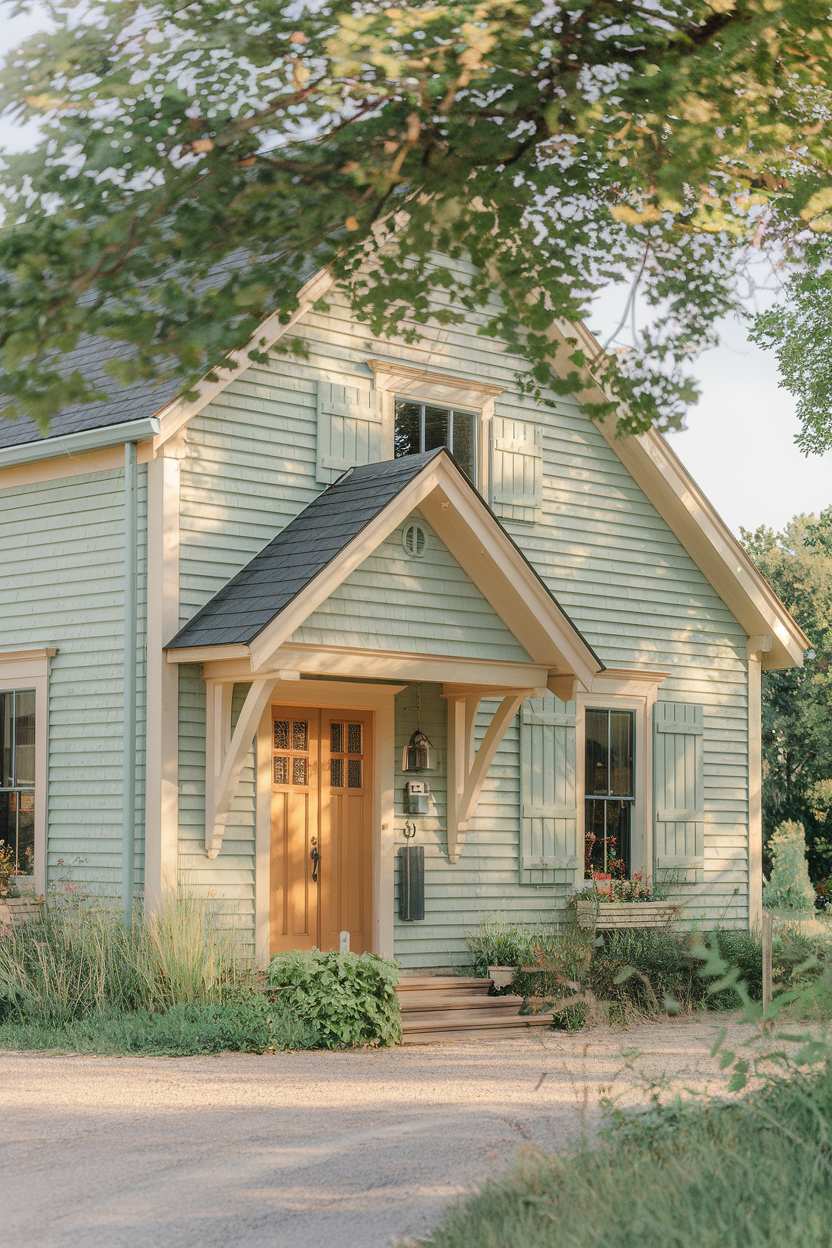
14. Transitional exterior color schemes
![]()
Transitional homes combine both traditional and modern elements, and the color scheme should do the same. I recommend using warm neutrals like beige or taupe, paired with darker shades like charcoal or navy. This creates a balanced, harmonious look that works with both classic and contemporary styles—perfect for homes that need a little something in between.
15. Stucco and stone exterior color schemes
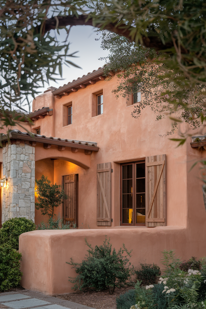
Stucco and stone create a stunning blend for Mediterranean or Southwestern-style homes. Earthy tones like terracotta, beige, and taupe are the perfect match for the natural textures of stone and stucco, creating a warm and inviting exterior. This color scheme is timeless and offers an effortlessly elegant vibe that’s both rustic and refined.
16. Eclectic exterior color schemes
This one’s for those of you design risk-takers out there! I’m talking bold combinations like coral, teal, and mustard yellow, mixed with softer neutrals like beige, gray, or white. It’s a playful, exciting way to express your personality and make your home stand out in the best possible way.
17. Cottage style exterior color schemes
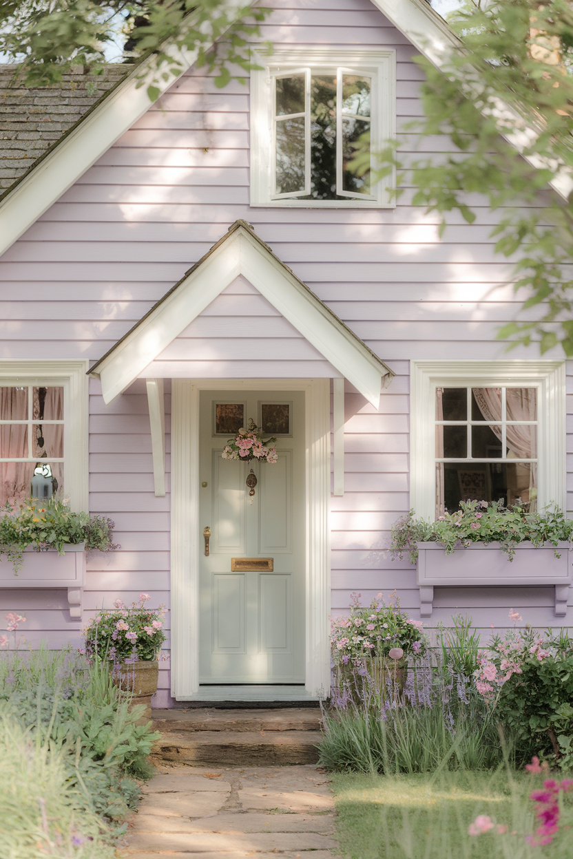
Cottage-style homes scream charm, and soft, pastel color schemes just add to that cozy, inviting feel. Lavender, pale blue, and mint green paired with crisp white trim will make your cottage feel like it belongs in a fairytale. It’s a garden-like, whimsical look that’s perfect for small homes or those with a rustic country vibe.
18. Mid-century modern exterior color schemes
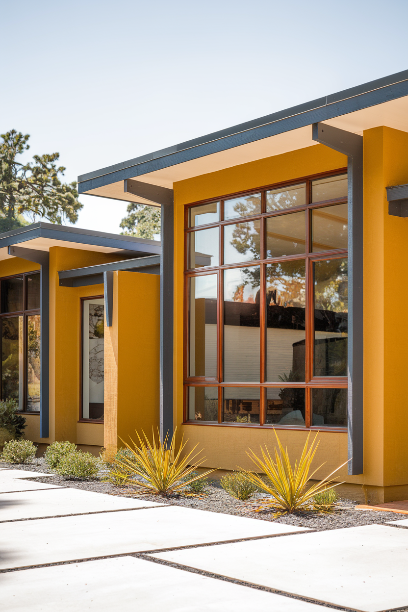
For a throwback to the 50s and 60s, mid-century modern exteriors use bold colors like mustard yellow, teal, and avocado green paired with minimalist neutrals like white or gray. It’s a retro look that feels fresh and modern at the same time, especially when combined with sleek geometric lines. A total classic!
19. Modern farmhouse with black trim
Want to add a bit of drama to your modern farmhouse? Pair light shades like white or gray with black trim. The bold contrast makes the architectural elements pop, giving your home a sleek, modern farmhouse look. Trust me, it’s a combo you won’t tire of anytime soon.
20. Art deco exterior color schemes
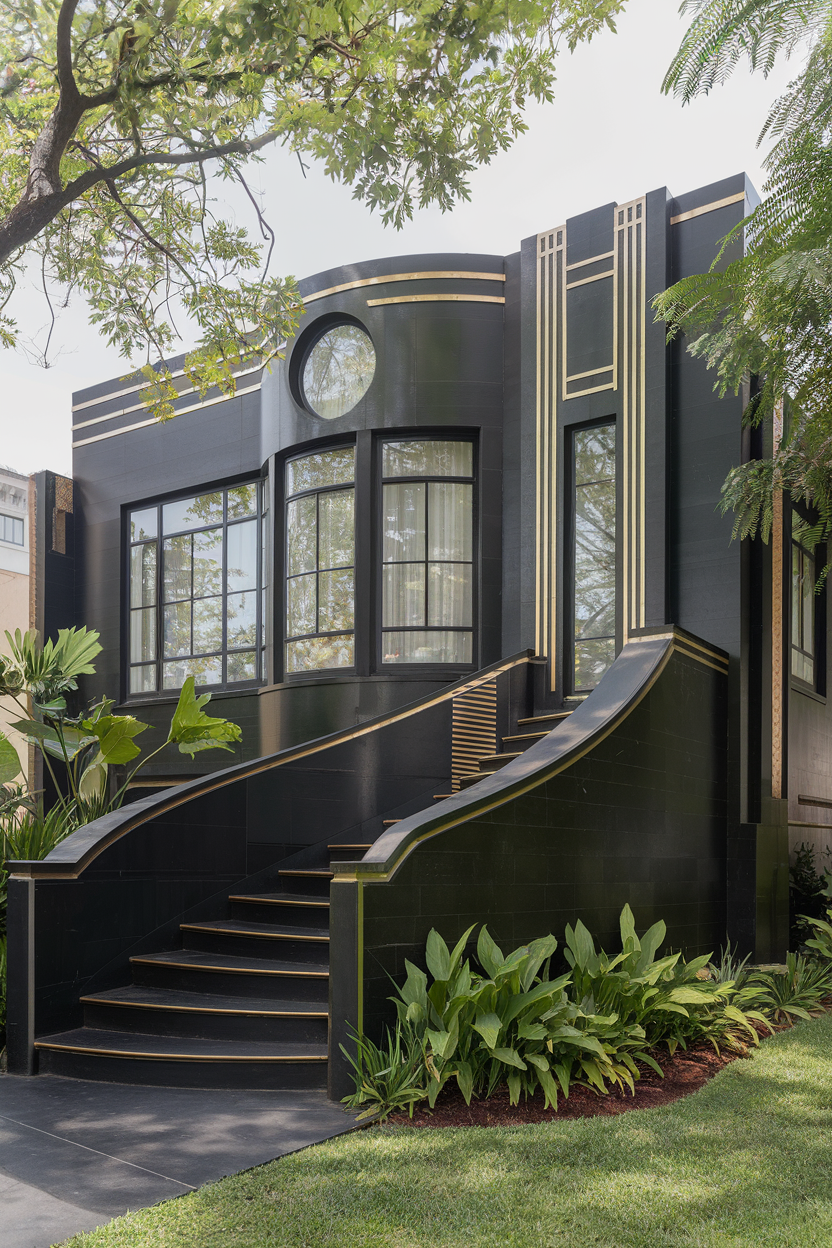
If you love glamour and luxury, an Art Deco-inspired color scheme might just be your dream. Think deep navy, gold, and black—these bold, luxurious colors will make your home feel chic and sophisticated. Add some metallic finishes or contrasting hues for extra drama, and you’ll have a showstopper of an exterior.
21. Dark and moody exterior color schemes
For a home that exudes sophistication and drama, dark and moody hues like charcoal gray, deep blue, and forest green are the way to go. These colors make a bold statement and pair beautifully with contrasting white or cream trim for a balanced, elegant look. Perfect for making your home feel mysterious and beautiful.
22. Natural wood and neutral tones
If you’re a fan of natural wood features, a neutral color scheme will really make your wood accents shine. Soft taupes, beige, and grays work beautifully with wood elements to create an organic, earthy feel. This combination is timeless and works wonders if you’re trying to highlight your home’s natural beauty.
23. Bright and bold exterior color schemes
For a home that really stands out, go with a bright and bold color scheme. Vibrant hues like hot pink, electric blue, or lime green will make your home the talk of the neighborhood. Balance out the intensity with neutral trim in white, black, or gray to keep the look grounded and avoid it feeling too overwhelming.
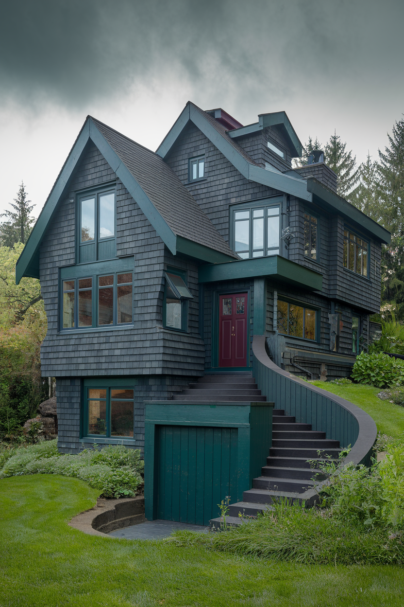
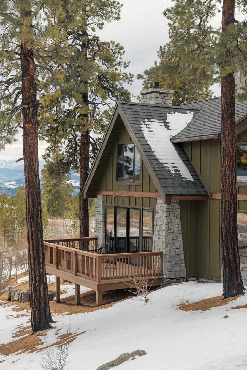
24. Mountain retreat exterior color schemes
25. Farmhouse with soft green and beige
If you love soft, muted tones, a farmhouse exterior with green and beige is the way to go. This pairing is warm, inviting, and timeless, evoking a peaceful, nature-inspired vibe. It’s the perfect look for a farmhouse that blends beautifully with its surroundings.
Tips for achieving timeless curb appeal with exterior color schemes
No matter what kind of home you have, the right color scheme can take your curb appeal to new heights. Use these 25 gorgeous ideas to find the perfect palette that reflects your style and stands the test of time. Final design tips to bear in mind:
- Balance bold colors with neutrals: I always recommend using a neutral base for your main color and adding pops of bold shades for the trim, shutters, or front door.
- Match your color scheme to your home’s style: Make sure your colors complement your home’s architecture. For example, rich tones work wonders for Victorian homes, while minimalist palettes are great for modern styles.
- Test before committing: Colors can look different in different light, so always test on a small area first.
- Consider the environment: Think about your surroundings when choosing your colors. Coastal areas look amazing with blues and greens, while mountain homes blend best with earthy tones.
Happy painting, friends! Let me know which one of these color schemes speak to you the most in the comments below.